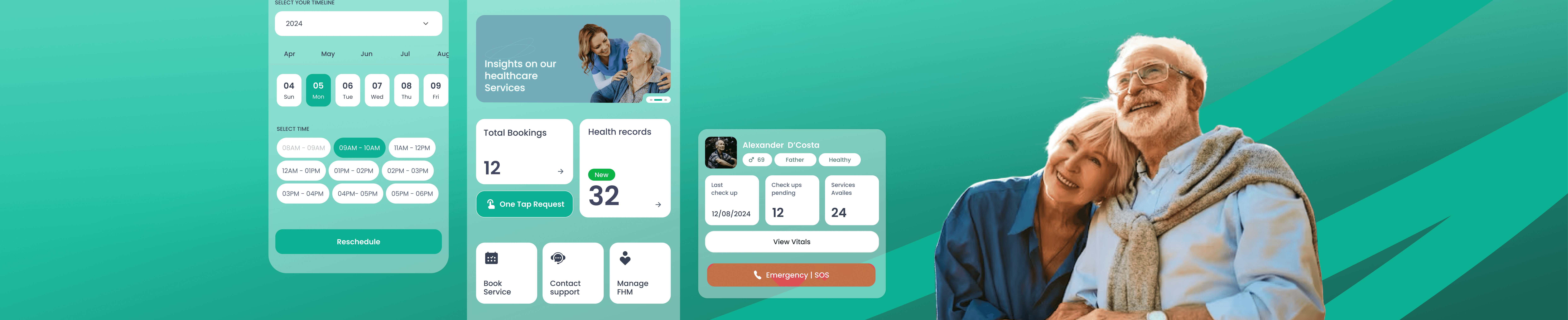

Healthcare
Mobile App
Shipped
Praana was a dated booking app for a two-sided service. Its real user, the family, was locked out.
Bookings
Health records
Medication reminders
Emergency SOS
complex
care services
End-to-end UI/UX and created Praana's first design system, built two integrated apps in just 4 months.
24/7
Praana
1m ago
Requested assistance
Made healthcare accessible for elders and care workers. Shipped on iOS and Android. Booking went from a multi-step flow to four taps, and every core screen clears WCAG AA for older eyes.
Live in US outpatient clinics
HIPAA compliant
Partnered with NYU Langone & St. Luke’s
Works with an 8-vital home device
Introduction
Praana brings the clinic home
Praana's old app was just a doctor booking page. So we rebuilt it into two apps: one for the family watching from afar, one for the health worker at the door.
Strategy & Planning
Praana brings care out of the hospital: home doctor visits, lab tests, video consults and monitoring for elders, all tied to real clinics and records.
I designed its first chapter, home care for Indian families, and it now runs in US clinics from Pennsylvania to Tennessee.
Works with Praana Edge, an FDA compliant vitals device
Plugs into hospital record systems like eClinicalWorks and Athena, over the FHIR health data standard.
Design & Development
Brane Enterprises built the platform, and I was one of three designers on a six person team. I designed most of it end to end, both apps and most of their flows and screens, working closely with the founders, doctors, hospital managers and legal.
The Problem
The world is aging faster than its software
By 2050 the number of people over 60 doubles to two billion. Most live far from their grown children, so when something goes wrong the person who worries most is in another city, on the phone, afraid.
The old app just found you a doctor. No family accounts, no records, no way for a daughter in one city to know if her father saw the doctor or took his medicine.
"The person most anxious about a patient's health is usually not the patient. Our real user was the family."
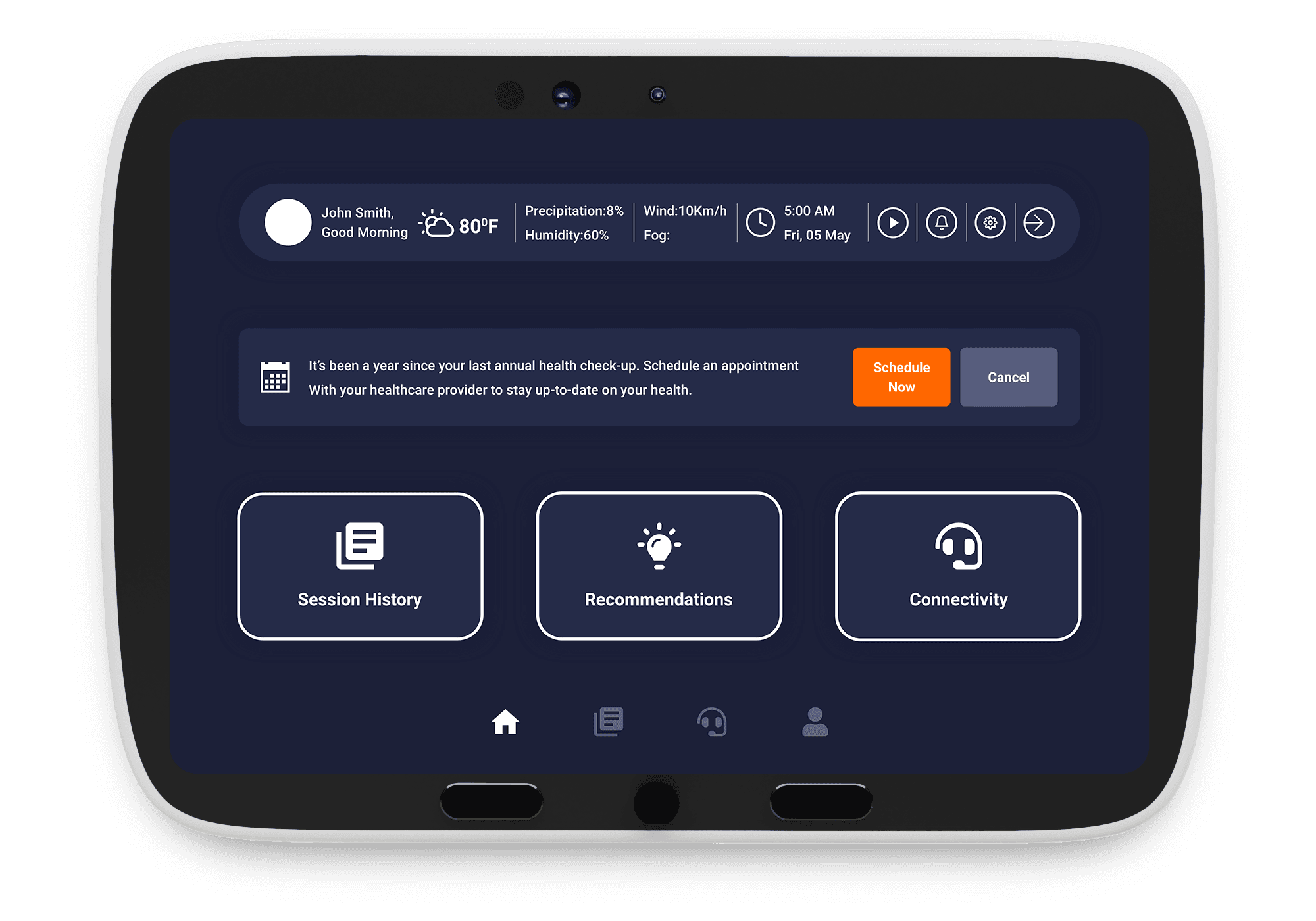

Praana's previous generation: a tablet companion, and a bare booking flow.


Legacy booking app
Praana began as a simple booking app, but once its device made care continuous, one basic app could no longer serve two very different users: the family managing an elder's health and the caregiver giving it.
The goal was to grow it into two clear apps, one for each, simple enough for aging eyes.
01
Rebuild everything
New architecture, new visual language, new features. Nothing from the old app survived except the lesson.
02
Design for two generations
Adult children who pay for care. Elderly parents who receive it. One app that respects both.
03
Integrate with system
Every promise on the family's screen needs a worker's tool behind it.
Research
Two users, one health record
Praana's doctors showed us how care breaks down at home: missed visits, records no one could verify, patients who couldn't describe their symptoms. Meanwhile our research team chased the hardest question: what can a 70 year old actually do with a smartphone?

The people Praana serves: Five stakeholders, one care loop
Elderly Parent
~70 · the patient
Thinks
“I don’t want to be a burden. Who’s at my door?”
Acts
Squints at small text, taps the wrong thing, leans on family
Needs
Large type, one action per screen, a real face at the door
Pain
Apps built for young thumbs and sharp eyes lock them out
Family Caregiver
adult child · books the care
Thinks
“Is Mum okay when I’m away? Did the visit actually happen?”
Acts
Books visits remotely, checks records, loops in siblings
Needs
Proof of each visit, one shared record, a fast way to escalate
Pain
Updates scattered across calls and chats, no single source of truth
Care Worker
does the home visit
Thinks
“What does this family expect from me today?”
Acts
Reads the brief, logs vitals, marks tasks, triggers SOS
Needs
A clear task list, quick vitals entry, respect as staff
Pain
Treated as a gig task, arrives with no context on the family
Doctor / Specialist
remote consult
Thinks
“Do I have enough context in ten minutes?”
Acts
Reviews history, runs the video consult, writes the note
Needs
Structured history, clear notes when the patient can’t explain
Pain
Walks in blind; history is a paper stack or a dated app
SOS / Emergency Team
when it goes wrong
Thinks
“Every second counts.”
Acts
Gets the alert, dispatches, calls the family
Needs
Instant location and medical context, a one-tap trigger
Pain
Minutes lost hunting for where the patient is and what they take
Caregiver runs the account
Children book, pay, and monitor. Parents receive care. The app had to serve both without confusing either.
Clear slots beat fuzzy ones
We assumed morning and evening would feel friendlier than clock times. It didn’t work, so the booking ships plain, fixed time slots.
A stranger at door is a real fear
Home healthcare only works if every visit can be proven. For the patient, and for the worker.
Two main user types for Praana Companion:
Persona 1
The long-distance caregiver
32, lives in a metro, books and monitors everything from the app. Wants proof, not promises.

Book Visits
Pays for the plan
Watches from afar
Needs verification and documentation
Persona 2
The parent
70+, may share a phone, needs big targets, familiar words, photos of real people, and a panic button that can't misfire.

Receives the care
Answers the door
SOS Emergencies
Needs basic digital literacy and a smartphone
The System
Every promise on the family's screen is a task on a worker's screen
We designed the service as a loop. A family books in Praana Companion, operations assigns a Field Health Manager, the worker proves the visit with a one time code in Praana Guide, and vitals flow back to the family and clinic. Praana runs on exception-based care: the system monitors broadly, flags narrowly, and escalates only the exceptions to a human.
Business model

The Design System
Two apps, hundreds of screens, one system
Two apps, but one token set holds them together. I named colour, type, spacing, and every component once, so a single mode switch takes Companion's teal to Guide's blue without touching a layout. Even the photography is a rule, not decoration: real elders and caregivers, shot the same way on every screen.


What I worked on
UX Research
Wireframing
UI Design

How we solved it
The upgraded app
Simplified and tailored
One app and one hamburger drawer for everyone became two apps, two bottom navs.
Now booking a nurse or doctor takes four taps: the parent, the service, the day, the time slot. Everything else, from records to reminders, hangs off that first booking.

Child booking for parent
Parent booking for self

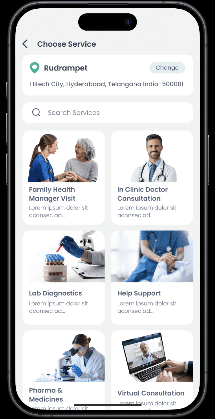


Every kind of care through one door
Four services are the headline. Behind them sit ambulance, hospitalization, vaccinations, nutrition and video consults by specialty, every doctor shown with a real photo.
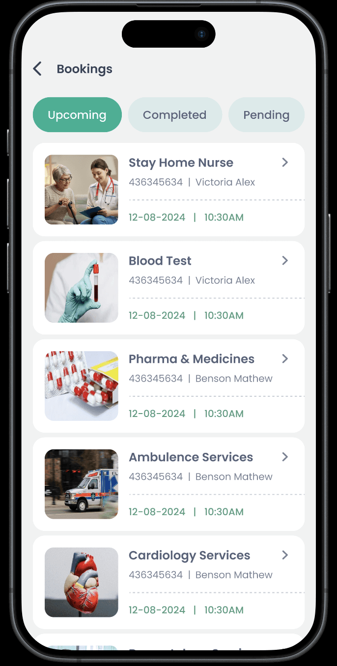
Every booking works the same way: pick the member, the service, the time. They all land in one place: upcoming, completed, pending.
The catch: the flow is paced for the parent who has never used an app, not the caregiver who books weekly. That keeps every booking simple for all.
One profile per parent
Every family member gets a card. Age, plan, pending check ups, last visit. One glance answers the question every child asks: is everything on track?





Records that survive the visit
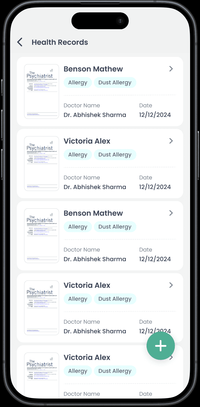
Health records, vitals and documents from every visit, kept per member and shareable with doctors.
Structured forms, not photo dumps
Vitals go in as typed fields with units, not photos of slips. That structure builds a 30, 90 and 365-day trend and flows straight into the hospital’s medical record, so a doctor sees the pattern between visits,
The catch: slower than snapping a photo. Documents still attach for everything else.
Opens B2B. Praana plugs into clinics over FHIR instead of living as a standalone app.
Reminders and habits
Medication reminders for each member go out as phone calls, so an elder who ignores notifications still picks up. A daily check in earns points, and families can book community classes and events between visits.
Reminder technology measurably improves medication adherence for older adults living at home. Systematic review, Age and Ageing, 2026.


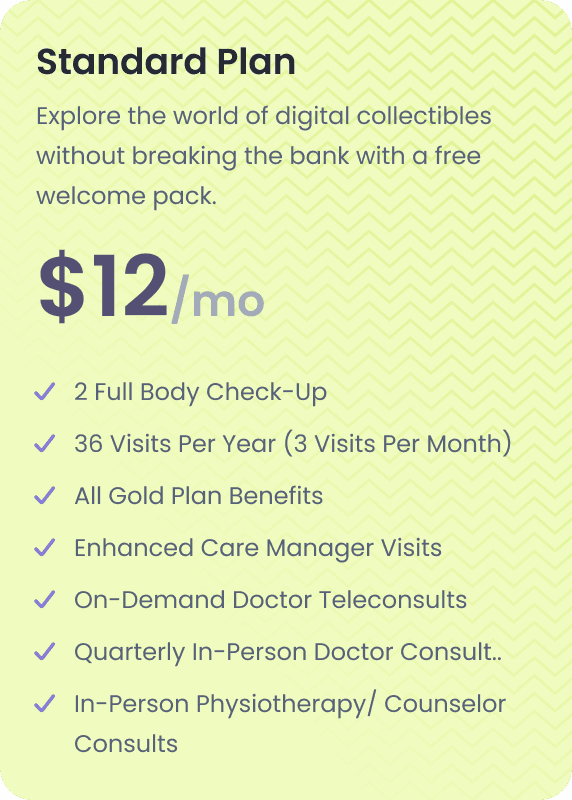

One plan, the whole family
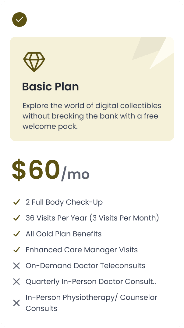
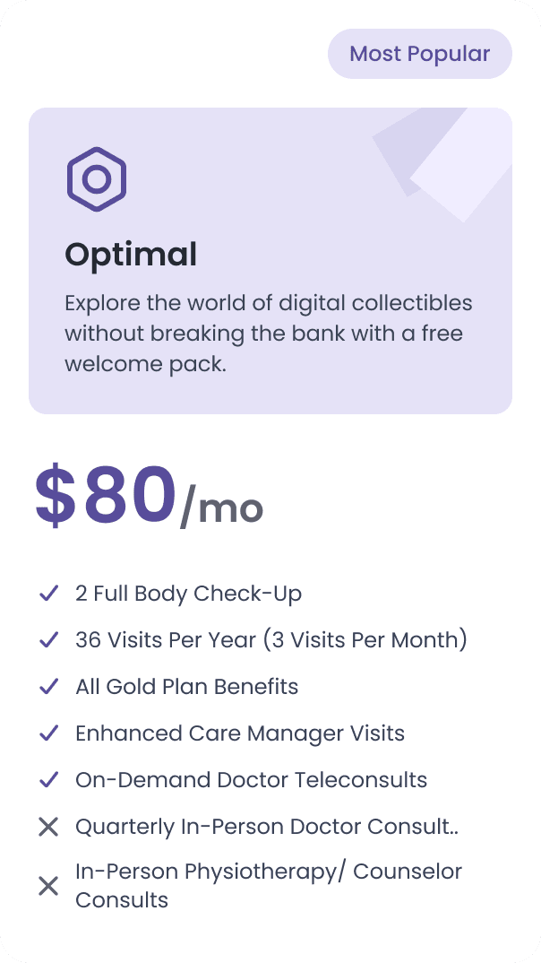
Care is bought per family, not per user, so one plan covers up to six members. That matches how these homes pay: one working child sponsors everyone, grandparents included.
One working child sponsors everyone. More value from every account.
Feedback: Rate the visit and the person
A one-time code proves every visit.
After a completed visit, families rate the service and the health worker separately, and can add a written note. Rating the worker by name keeps the field team accountable.
Fewer “did they come?” disputes and refunds, and a subscription that's easier to keep.


SOS · Core Flow
When something goes wrong
I designed the SOS flow: a three second countdown, a big number, and one thumb sized "I'm Safe" button. Then alerts fire to emergency contacts and family at once, because a false alarm you can't cancel teaches people to fear the button they need most.
The Decision
Three seconds to cancel
Elderly hands misfire, so the countdown makes a false alarm free: "I'm Safe" is the biggest thing on screen. If it scares people, they won't use it when they need it.
Addresses, not just phone numbers
SOS setup pins each emergency contact on a map, so when the alert fires, who is nearest matters as much as who picks up. The same alert reaches the family and Praana's emergency team at once, and it ends in a live call, not a notification.
The catch: a real emergency waits three extra seconds, so nobody is ever scared to press the button.
The care team app · Praana Guide
The app for the person who shows up
Field Health Managers spend the day moving between homes, so Praana Guide is built around one word: today. Today's visits, today's emergencies, and the fastest path from "I'm at the door" to "visit recorded".

01
The day at a glance
Visit counts, the emergency queue, and a schedule ordered by time and place. Nothing to decode in a rush.
02
Trust at the door
A visit starts only when the worker enters a one time code from the patient's phone. Both sides get proof: the family knows who came, the worker can show they were there.
03
Real jobs, real tools
Bulk vitals, bookings on a patient's behalf, leave requests, patient handovers. The plumbing that decides whether the service works.
The unglamorous half of the worker's day
Guide records vitals for a whole queue, books visits for patients who can't, and hands a patient to a colleague with their full history. It also runs the worker's own day: shifts, leave, expenses and escalations.


The Decision
Proof over convenience: a one time code at the door
A one time code from the patient's phone proves both sides agreed the visit began, so the family knows it happened and the worker can prove they were there.
The catch: ten awkward seconds at the door, and it needs the phone nearby. Worth it for proof both sides can trust.
Also on the board
Beyond the two apps, we explored a third surface: a tool for staff and partners to manage records on Praana's behalf. It stayed an exploration, but it sharpened how we thought about who else touches this data.
Tried & Failed
Explorations: what we tried and set aside
Not everything made it in. We tried different home screen layouts, a blood and plasma donation match, and several pricing structures before settling the ones that shipped.

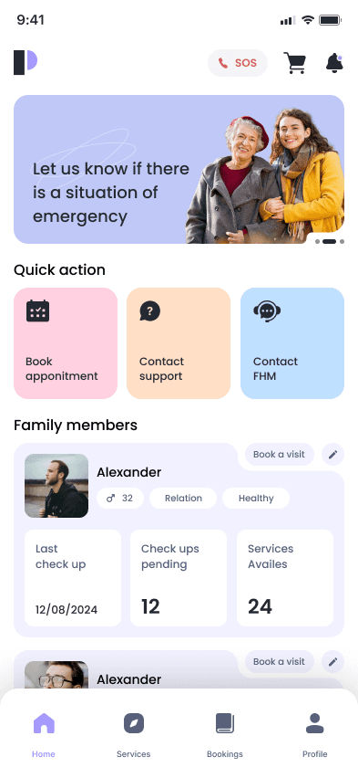


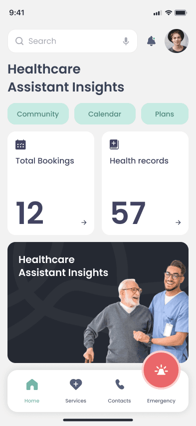

Color and Theme


Layout and Information Architecture
Accessibility
Built to be read by 70-year-old eyes
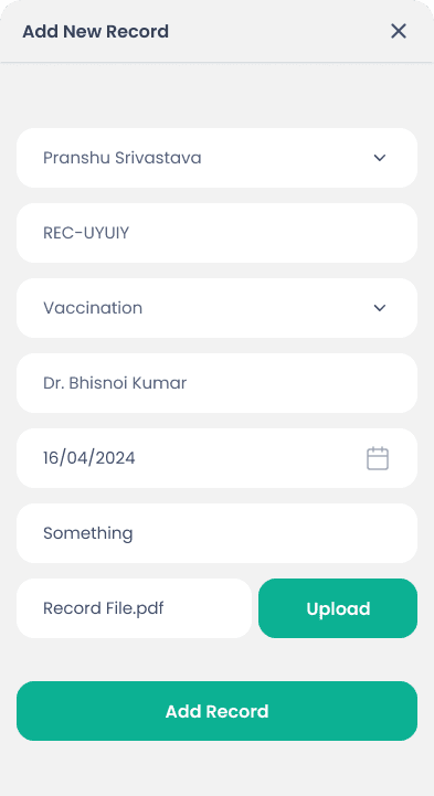
Mostly one question per screen. Buttons sit right where thumbs naturally rest.

7/7 Core pairs pass WCAG AA. Large, spacious text and familiar words for easy reading.
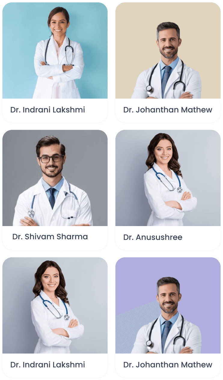
Real photos and names. Trust starts with seeing a real human face.

Simple, direct labels. Easy to understand in any language.
Text mostly accompanies icon or color. Meanings and warnings are never missed.

Health data stays private. Records open only to the family and clinicians who need them.
Impact
Shipped, live, and in daily use. Part of the system
The platform now runs in US outpatient clinics with NYU Langone and St. Luke's, with thousands of vitals measurements captured from real patients and written straight into the EMR through eClinicalWorks and Athena over FHIR. Praana reports the model reducing hospitalisations for high-risk patients.
My design is the base loop that made it usable day to day: the booking, the vitals, the reminders, the SOS.

Looking Back
What this project taught me
The elder is the spec, not the edge case
Most users are near 70, on a small phone, in a second language. Design for them, and everyone else gets an easier app.
Protecting health data is design work
We chose what shows at a glance and what stays taps away, The design decides privacy here as much as the backend does.
A booking is only as good as the visit
The family app only earns trust because a real worker shows up and logs the visit. I designed both apps as one loop.
Designing with constraints. Doctors, hospital managers, and legal set the real constraints, what data can live where, what a worker can prove, what a clinic will accept. Those shaped the product more than any moodboard. I learned to treat the room as the brief.
What I'd do next: point AI at the riskiest moments, with a human always deciding. Flag a vital that keeps creeping up before a visit is even booked. Turn an elder's spoken symptoms into a clean note the doctor can trust. Send the family a weekly summary that calls a real person when a reading looks wrong.